Helping remote workers find suitable public workspaces with confidence.
Role: Sole Product Designer (with mentorship from a Chief Design Officer)
Timeline: 1 week-long modified GV design sprint for my Springboard UI/UX certification
Constraints: Project prompt; Limited time; Sole designer; Users had to be able to find a place that already exists; Solution had to be a mobile app
Impact: 4/5 Participants were confident they would be able to find a place to work from; 3/5 Participants found the service to be “easy to understand”
Overview
PostUp is a mobile app concept that helps remote workers quickly find suitable public places to work by surfacing key environmental factors upfront.
Problem
Remote workers struggle to confidently choose public workspaces due to unclear information around noise, crowding, and available amenities.
Design Direction
Confidence through instant clarity.
PostUp prioritizes immediate understanding of a space by surfacing crowd, noise, and amenities at a glance, directly reducing uncertainty when choosing where to work.

Core Experience Model
From discovery to confident choice.
The experience guides users from scanning nearby options to selecting a workspace by progressively reducing uncertainty through real time conditions and community input.

System Structure
Organizing exploration and access.
Navigation and feature grouping ensure users can move between discovery, decision making, and saved places without friction.

Interaction Structure
Clarifying how users interpret spaces.
Wireframes were used to refine how crowd, noise, and amenities are communicated, ensuring users can quickly interpret a space and confidently decide without hesitation.

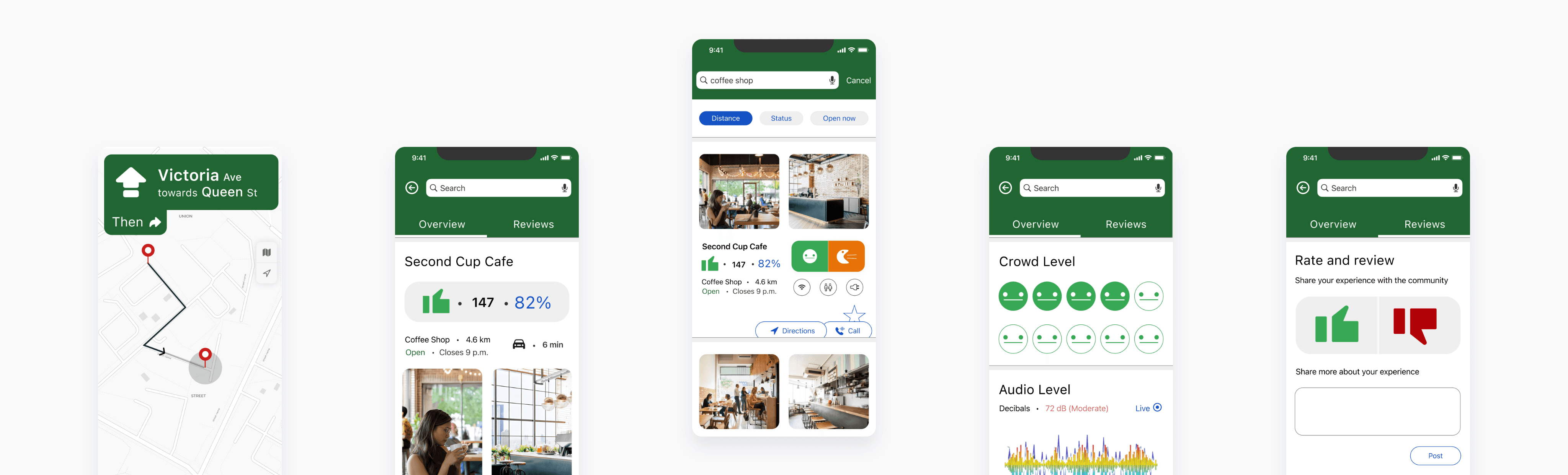
Final Execution
A fast, decision focused interface.
The final design enables users to evaluate and choose a workspace within seconds, minimizing friction in making a confident decision.
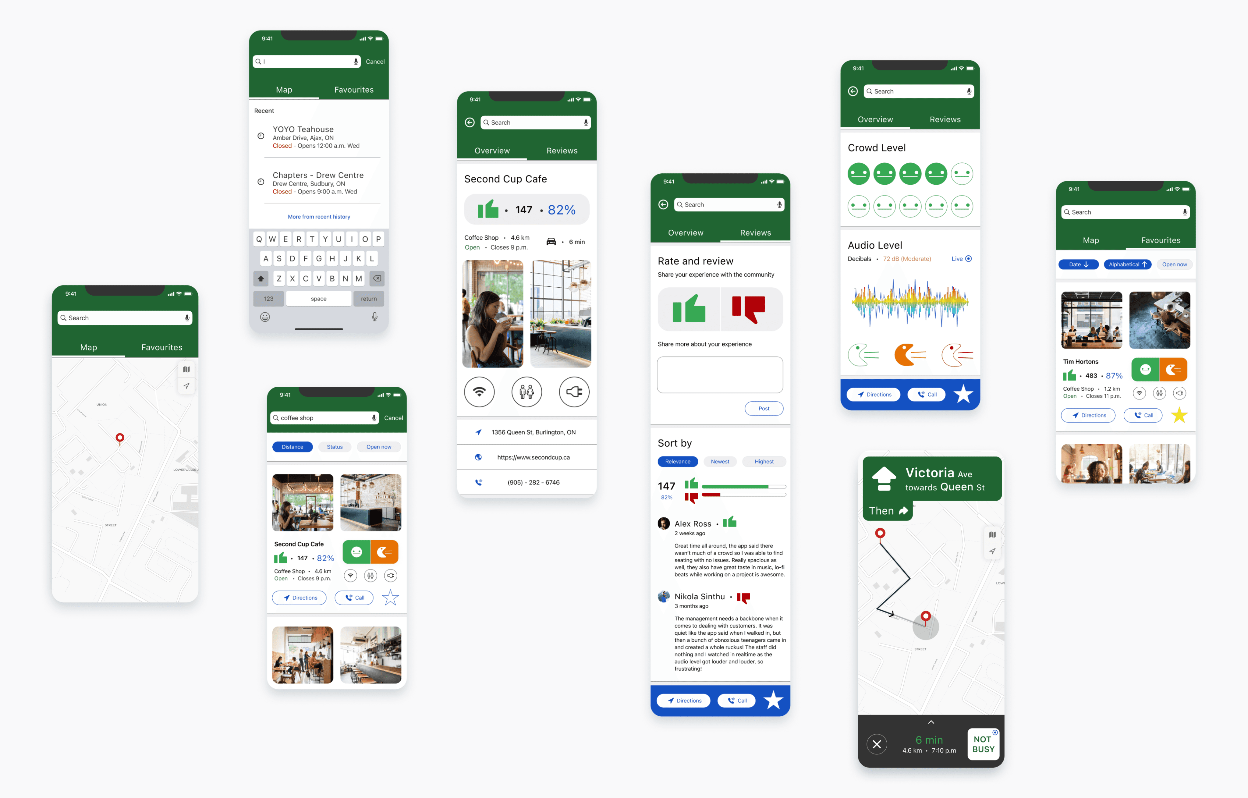
Impact
Confidence improves usability.
User testing showed that clear status indicators increased confidence, though refinements were needed to improve clarity of certain elements.

Helping remote workers find suitable public workspaces with confidence.
Quick Read
Full Case Study
Role: Sole Product Designer (with mentorship from a Chief Design Officer)
Timeline: 1 week-long modified GV design sprint for my Springboard UI/UX certification
Constraints: Project prompt; Limited time; Sole designer; Users had to be able to find a place that already exists; Solution had to be a mobile app
Impact: 4/5 Participants were confident they would be able to find a place to work from; 3/5 Participants found the service to be “easy to understand”
Overview
PostUp is a mobile app concept that helps remote workers quickly find suitable public places to work by surfacing key environmental factors upfront.
Problem
Remote workers struggle to confidently choose public workspaces due to unclear information around noise, crowding, and available amenities.
Design Direction
Confidence through instant clarity.
PostUp prioritizes immediate understanding of a space by surfacing crowd, noise, and amenities at a glance, directly reducing uncertainty when choosing where to work.
Core Experience Model
From discovery to confident choice.
The experience guides users from scanning nearby options to selecting a workspace by progressively reducing uncertainty through real time conditions and community input.
System Structure
Organizing exploration and access.
Navigation and feature grouping ensure users can move between discovery, decision making, and saved places without friction.
Interaction Structure
Clarifying how users interpret spaces.
Wireframes were used to refine how crowd, noise, and amenities are communicated, ensuring users can quickly interpret a space and confidently decide without hesitation.
Final Execution
A fast, decision focused interface.
The final design enables users to evaluate and choose a workspace within seconds, minimizing friction in making a confident decision.
Impact
Confidence improves usability.
User testing showed that clear status indicators increased confidence, though refinements were needed to improve clarity of certain elements.
Helping remote workers find suitable public workspaces with confidence.
Quick Read
Full Case Study
Timeline: 1 week-long modified GV design sprint for my Springboard UI/UX certification
Constraints: Project prompt; Limited time; Sole designer; Users had to be able to find a place that already exists; Solution had to be a mobile app
Impact: 4/5 Participants were confident they would be able to find a place to work from; 3/5 Participants found the service to be “easy to understand”
Role: Sole Product Designer (with mentorship from a Chief Design Officer)
Overview
PostUp is a mobile app concept that helps remote workers quickly find suitable public places to work by surfacing key environmental factors upfront.
Problem
Remote workers struggle to confidently choose public workspaces due to unclear information around noise, crowding, and available amenities.
Design Direction
Confidence through instant clarity.
PostUp prioritizes immediate understanding of a space by surfacing crowd, noise, and amenities at a glance, directly reducing uncertainty when choosing where to work.
Core Experience Model
From discovery to confident choice.
The experience guides users from scanning nearby options to selecting a workspace by progressively reducing uncertainty through real time conditions and community input.
System Structure
Organizing exploration and access.
Navigation and feature grouping ensure users can move between discovery, decision making, and saved places without friction.
Interaction Structure
Clarifying how users interpret spaces.
Wireframes were used to refine how crowd, noise, and amenities are communicated, ensuring users can quickly interpret a space and confidently decide without hesitation.
Final Execution
A fast, decision focused interface.
The final design enables users to evaluate and choose a workspace within seconds, minimizing friction in making a confident decision.
Impact
Confidence improves usability.
User testing showed that clear status indicators increased confidence, though refinements were needed to improve clarity of certain elements.